

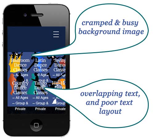
Visitors will stay on your site and read content IF your site is easy to use…on ALL devices. Maybe your site looks great on a desktop or laptop, but on a mobile device or phone, you look like this:
As Form Web Design says, “…mobile is not the future, it is the now. Meet your customers in the environment of their choice.”
Nobody is going to stay on a site that is unreadable and scrambled on their phone. However, many small business owners with websites may have this problem and not even know it.
We came across a great site where you can easily see how your site looks on ANY device. Media Genesis offers a Responsive Website Design Checker.
All you need to do is enter your (URL) website address, and it shows you exactly how your site is displayed on any device.
If you don’t like what you see, get it fixed. Make sure your site is always responsive and looks great.